WAI-ARIA:Role=Button
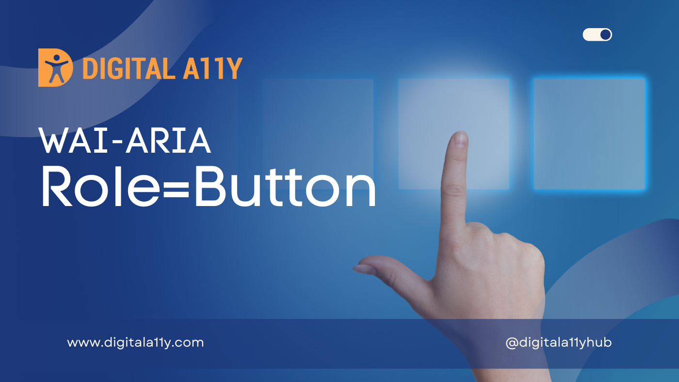
An input that allows for user-triggered actions when clicked or pressed.
Description
An input that allows for user-triggered actions when clicked or pressed. See related link.
Buttons are mostly used for discrete actions. Standardizing the appearance of buttons enhances the user’s recognition of the widgets as buttons and allows for a more compact display in toolbars.
Buttons support the optional attribute aria-pressed. Buttons with a non-empty aria-pressed attribute are toggle buttons. When aria-pressed is true the button is in a “pressed” state, when aria-pressed is false it is not pressed. If the attribute is not present, the button is a simple command button.
Screen Reader Support For Role=Button
| Expectation | JAWS | Narrator | NVDA | Orca | TalkBack | VoiceOver (iOS) | VoiceOver (macOS) | ||||
|---|---|---|---|---|---|---|---|---|---|---|---|
| Chrome | Edge | Firefox | Edge | Chrome | Edge | Firefox | Firefox | Chrome | Safari | Safari | |
| MUST convey its name | supported | supported | supported | supported | supported | supported | supported | supported | supported | supported | supported |
| MUST convey its role | supported | supported | supported | supported | supported | supported | supported | supported | supported | supported | supported |
Role=Button Example
HTML Example 1
<a href="/continue.html" role="button">Continue</a>HTML Example 2
<div role="toolbar" tabindex="0" id="customToolbar"><img src="/img/btn1.gif" tabindex="0" role="button" id="b1" alt="Home"><img src="/img/btn2.gif" tabindex="-1" role="button" id="b2" alt="Refresh"><img src="/img/btn3.gif" tabindex="-1" role="button" id="b3" alt="Help"></div>Characteristics
Superclass Role
Base Concept
- HTML button
Related Concepts
- link
- XForms trigger
Supported States and Properties
Inherited States and Properties
- aria-atomic
- aria-busy (state)
- aria-controls
- aria-current (state)
- aria-describedby
- aria-details
- aria-disabled (state)
- aria-dropeffect
- aria-errormessage
- aria-flowto
- aria-grabbed (state)
- aria-haspopup
- aria-hidden (state)
- aria-invalid (state)
- aria-keyshortcuts
- aria-label
- aria-labelledby
- aria-live
- aria-owns
- aria-relevant
- aria-roledescription
Name From
- contents
- author
Accessible Name Required
- True
Children Presentational
- True
Semantic HTML
Use the HTML <button> tag.
<button type="button">Click Me!</button>
Reference
- WAI-ARIA 1.2 Specification
Refer to the notes from the WAI-ARIA 1.2 specification for more information on role=button. - A11Y Support
The screenreader compatibility for each of the ARIA attributes is taken from the A11Y Support. Please refer to the original source if screenreader compatibility is updated for role=button.
