WCAG Checklist: A Simplified Guide to WCAG 2.2 AA
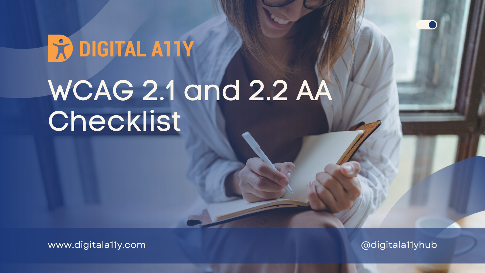
I made this WCAG checklist for personal use when I initially got started in accessibility. I always referred to accessibility checklists from around the web to help me during manual accessibility audits or interview preparation. After I started writing about understanding the WCAG in simplified language, my friends and I made sure to pin down the key points, and we collated all those points into this WCAG 2.2 AA checklist.
This accessibility checklist is created with designers, developers, testers, and other stakeholders in mind. By following the guidance provided in this WCAG checklist, best practices can be implemented to ensure that your products and services are accessible and inclusive.
I hope this WCAG 2.2 AA checklist comes in as handy to all my readers as it has for me on multiple occasions.
WCAG 2.2 Level AA Checklist
WCAG 2.2 Level AA Checklist
| Criterion | Level | Summary | Points to Ponder |
|---|---|---|---|
| 1.1.1 Non-Text Content | A | Provide text alternatives for non-text content that serves the same purpose. |
|
| 1.2.1 Audio-Only and Video-Only | A | Provide an alternative to video-only and audio-only content. |
|
| 1.2.2 Captions (Prerecorded) | A | Provide captions for videos with audio. |
|
| 1.2.3 Audio Description or Media Alternative | A | Provide audio description or text transcript for videos with sound. |
|
| 1.2.4 Captions (Live) | AA | Add captions to live videos. |
|
| 1.2.5 Audio Description (Pre-Recorded) | AA | Provide audio descriptions for pre-recorded videos. |
|
| 1.3.1 Info and Relationships | A | Content, structure and relationships can be programmatically determined. |
|
| 1.3.2 Meaningful Sequence | A | Present content in a meaningful order. |
|
| 1.3.3 Sensory Characteristics | A | Instructions don’t rely solely on sensory characteristics. |
|
| 1.3.4 Orientation | AA | Your website adapts to portrait and landscape views. |
|
| 1.3.5 Identify Input Purpose | AA | The purpose of input fields must be programmatically determinable. |
|
| 1.4.1 Use of Color | A | Don’t use presentation that relies solely on colour. |
|
| 1.4.2 Audio Control | A | Don’t play audio automatically. |
|
| 1.4.3 Contrast Minimum | AA | Contrast ratio between text and background is at least 4.5:1. |
|
| 1.4.4 Resize Text | AA | Text can be resized to 200% without loss of content or function. |
|
| 1.4.5 Images of Text | AA | Don’t use images of text. |
|
| 1.4.10 Reflow | AA | Content retains meaning and function without scrolling in two dimensions. |
|
| 1.4.11 Non-Text Contrast | AA | The contrast between user interface components, graphics and adjacent colours is at least 3:1. |
|
| 1.4.12 Text Spacing | AA | Content and function retain meaning when users change elements of text spacing. |
|
| 1.4.13 Content on Hover or Focus | AA | When hover or focus triggers content to appear, it is dismissible, hoverable and persistent. |
|
| 2.1.1 Keyboard | A | All functionality is accessible by keyboard with no specific timings. |
|
| 2.1.2 No keyboard Trap | A | Users can navigate to and from all content using a keyboard. |
|
| 2.1.4 Character Key Shortcuts | A | Allow users to turn off or remap single-key character shortcuts. |
|
| 2.2.1 Timing Adjustable | A | Provide user controls to turn off, adjust or extend time limits. |
|
| 2.2.2 Pause, Stop, Hide | A | Provide user controls to pause, stop and hide moving and auto-updating content. |
|
| 2.3.1 Three Flashes or Below | A | No content flashes more than three times per second. |
|
| 2.4.1 Bypass Blocks | A | Provide a way for users to skip repeated blocks of content. |
|
| 2.4.2 Page Titled | A | Use helpful and clear page titles. |
|
| 2.4.3 Focus Order | A | Components receive focus in a logical sequence. |
|
| 2.4.4 Link Purpose (In Context) | A | Every link’s purpose is clear from its text or context. |
|
| 2.4.5 Multiple Ways | AA | Offer at least two ways to find pages on your website. |
|
| 2.4.6 Headings and Labels | AA | Headings and labels describe topic or purpose. |
|
| 2.4.7 Focus Visible | AA | Keyboard focus is visible when used. |
|
| 2.4.11 Focus Not Obscured (Minimum) | AA | When a user interface component is selected, the focus indicator encompasses the visual presentation of the component, maintains a contrast ratio of at least 3:1 between its pixels in focused and unfocused states, and ensures a contrast ratio of at least 3:1 against adjacent colors. |
|
| 2.5.1 Pointer Gestures | A | Multi-point and path-based gestures can be operated with a single pointer. |
|
| 2.5.2 Pointer Cancellation | A | Functions don’t complete on the down-click of a pointer. |
|
| 2.5.3 Label in Name | A | Where a component has a text label, the name of the component also contains the text displayed. |
|
| 2.5.4 Motion Actuation | A | Functions operated by motion can also be operated through an interface and responding to motion can be disabled. |
|
| 2.5.7 Dragging Movements | AA | All functionality that uses a dragging movement for operation can be achieved by a single pointer without dragging, unless dragging is essential or the functionality is determined by the user agent and not modified by the author. |
|
| 2.5.8 Target Size (Minimum) | AA | Ensure the target of any UI element has 24 by 24 CSS PX target size or there is enough spacing provided between two targets that have undersize targets. |
|
| 3.1.1 Language of Page | A | Each webpage has a default human language assigned. |
|
| 3.1.2 Language of Parts | AA | Each part of a webpage has a default human language assigned. |
|
| 3.2.1 On Focus | A | Elements do not change when they receive focus. |
|
| 3.2.2 On Input | A | Elements do not change when they receive input. |
|
| 3.2.3 Consistent Navigation | AA | Position menus and standard controls consistently. |
|
| 3.2.4 Consistent Identification | AA | Identify components with the same function consistently. |
|
| 3.2.6 Consistent Help | A | Help options are presented programmatically in the same order. |
|
| 3.3.1 Error Identification | A | Identify and describe input errors for users. |
|
| 3.3.2 Labels or Instruction | A | Provide labels or instructions for user input. |
|
| 3.3.3 Error Suggestion | AA | Suggest corrections when users make mistakes. |
|
| 3.3.4 Error Prevention (Legal, Financial, Data) | AA | Check, confirm and allow reversal of pages that cause important commitments. |
|
| 3.3.7 Redundant Entry | A | Autofill form- fields that repeat across steps. |
|
| 3.3.8 Accessible Authentication (Minimum) | AA | It states that users must be able to access authentication methods using only a keyboard. This means that the authentication process should not require the use of a mouse or other pointing device. |
|
| 4.1.2 Name, Role, Value | A | The name and role of user components can be understood by technology. |
|
| 4.1.3 Status Messages | AA | Make sure that all messages indicating success or errors are read out by a screen reader. |
|
WCAG 2.1 Level AA Checklist
| Criterion | Level | Summary | Points to Ponder |
|---|---|---|---|
| 1.1.1 Non-Text Content | A | Provide text alternatives for non-text content that serves the same purpose. |
|
| 1.2.1 Audio-Only and Video-Only | A | Provide an alternative to video-only and audio-only content. |
|
| 1.2.2 Captions (Prerecorded) | A | Provide captions for videos with audio. |
|
| 1.2.3 Audio Description or Media Alternative | A | Provide audio description or text transcript for videos with sound. |
|
| 1.2.4 Captions (Live) | AA | Add captions to live videos. |
|
| 1.2.5 Audio Description (Pre-Recorded) | AA | Provide audio descriptions for pre-recorded videos. |
|
| 1.3.1 Info and Relationships | A | Content, structure and relationships can be programmatically determined. |
|
| 1.3.2 Meaningful Sequence | A | Present content in a meaningful order. |
|
| 1.3.3 Sensory Characteristics | A | Instructions don’t rely solely on sensory characteristics. |
|
| 1.3.4 Orientation | AA | Your website adapts to portrait and landscape views. |
|
| 1.3.5 Identify Input Purpose | AA | The purpose of input fields must be programmatically determinable. |
|
| 1.4.1 Use of Color | A | Don’t use presentation that relies solely on colour. |
|
| 1.4.2 Audio Control | A | Don’t play audio automatically. |
|
| 1.4.3 Contrast Minimum | AA | Contrast ratio between text and background is at least 4.5:1. |
|
| 1.4.4 Resize Text | AA | Text can be resized to 200% without loss of content or function. |
|
| 1.4.5 Images of Text | AA | Don’t use images of text. |
|
| 1.4.10 Reflow | AA | Content retains meaning and function without scrolling in two dimensions. |
|
| 1.4.11 Non-Text Contrast | AA | The contrast between user interface components, graphics and adjacent colours is at least 3:1. |
|
| 1.4.12 Text Spacing | AA | Content and function retain meaning when users change elements of text spacing. |
|
| 1.4.13 Content on Hover or Focus | AA | When hover or focus triggers content to appear, it is dismissible, hoverable and persistent. |
|
| 2.1.1 Keyboard | A | All functionality is accessible by keyboard with no specific timings. |
|
| 2.1.2 No keyboard Trap | A | Users can navigate to and from all content using a keyboard. |
|
| 2.1.4 Character Key Shortcuts | A | Allow users to turn off or remap single-key character shortcuts. |
|
| 2.2.1 Timing Adjustable | A | Provide user controls to turn off, adjust or extend time limits. |
|
| 2.2.2 Pause, Stop, Hide | A | Provide user controls to pause, stop and hide moving and auto-updating content. |
|
| 2.3.1 Three Flashes or Below | A | No content flashes more than three times per second. |
|
| 2.4.1 Bypass Blocks | A | Provide a way for users to skip repeated blocks of content. |
|
| 2.4.2 Page Titled | A | Use helpful and clear page titles. |
|
| 2.4.3 Focus Order | A | Components receive focus in a logical sequence. |
|
| 2.4.4 Link Purpose (In Context) | A | Every link’s purpose is clear from its text or context. |
|
| 2.4.5 Multiple Ways | AA | Offer at least two ways to find pages on your website. |
|
| 2.4.6 Headings and Labels | AA | Headings and labels describe topic or purpose. |
|
| 2.4.7 Focus Visible | AA | Keyboard focus is visible when used. |
|
| 2.5.1 Pointer Gestures | A | Multi-point and path-based gestures can be operated with a single pointer. |
|
| 2.5.2 Pointer Cancellation | A | Functions don’t complete on the down-click of a pointer. |
|
| 2.5.3 Label in Name | A | Where a component has a text label, the name of the component also contains the text displayed. |
|
| 2.5.4 Motion Actuation | A | Functions operated by motion can also be operated through an interface and responding to motion can be disabled. |
|
| 3.1.1 Language of Page | A | Each webpage has a default human language assigned. |
|
| 3.1.2 Language of Parts | AA | Each part of a webpage has a default human language assigned. |
|
| 3.2.1 On Focus | A | Elements do not change when they receive focus. |
|
| 3.2.2 On Input | A | Elements do not change when they receive input. |
|
| 3.2.3 Consistent Navigation | AA | Position menus and standard controls consistently. |
|
| 3.2.4 Consistent Identification | AA | Identify components with the same function consistently. |
|
| 3.3.1 Error Identification | A | Identify and describe input errors for users. |
|
| 3.3.2 Labels or Instruction | A | Provide labels or instructions for user input. |
|
| 3.3.3 Error Suggestion | AA | Suggest corrections when users make mistakes. |
|
| 3.3.4 Error Prevention (Legal, Financial, Data) | AA | Check, confirm and allow reversal of pages that cause important commitments. |
|
| 4.1.1 Parsing | A | Ensure markup content uses proper syntax with complete tags, correct nesting, unique attributes, and valid IDs. |
|
| 4.1.2 Name, Role, Value | A | The name and role of user components can be understood by technology. |
|
| 4.1.3 Status Messages | AA | Make sure that all messages indicating success or errors are read out by a screen reader. |
|
WCAG 2.0 Level AA Checklist
| Criterion | Level | Summary | Points to Ponder |
|---|---|---|---|
| 1.1.1 Non-Text Content | A | Provide text alternatives for non-text content that serves the same purpose. |
|
| 1.2.1 Audio-Only and Video-Only | A | Provide an alternative to video-only and audio-only content. |
|
| 1.2.2 Captions (Prerecorded) | A | Provide captions for videos with audio. |
|
| 1.2.3 Audio Description or Media Alternative | A | Provide audio description or text transcript for videos with sound. |
|
| 1.2.4 Captions (Live) | AA | Add captions to live videos. |
|
| 1.2.5 Audio Description (Pre-Recorded) | AA | Provide audio descriptions for pre-recorded videos. |
|
| 1.3.1 Info and Relationships | A | Content, structure and relationships can be programmatically determined. |
|
| 1.3.2 Meaningful Sequence | A | Present content in a meaningful order. |
|
| 1.3.3 Sensory Characteristics | A | Instructions don’t rely solely on sensory characteristics. |
|
| 1.4.1 Use of Color | A | Don’t use presentation that relies solely on colour. |
|
| 1.4.2 Audio Control | A | Don’t play audio automatically. |
|
| 1.4.3 Contrast Minimum | AA | Contrast ratio between text and background is at least 4.5:1. |
|
| 1.4.4 Resize Text | AA | Text can be resized to 200% without loss of content or function. |
|
| 1.4.5 Images of Text | AA | Don’t use images of text. |
|
| 2.1.1 Keyboard | A | All functionality is accessible by keyboard with no specific timings. |
|
| 2.1.2 No keyboard Trap | A | Users can navigate to and from all content using a keyboard. |
|
| 2.2.1 Timing Adjustable | A | Provide user controls to turn off, adjust or extend time limits. |
|
| 2.2.2 Pause, Stop, Hide | A | Provide user controls to pause, stop and hide moving and auto-updating content. |
|
| 2.3.1 Three Flashes or Below | A | No content flashes more than three times per second. |
|
| 2.4.1 Bypass Blocks | A | Provide a way for users to skip repeated blocks of content. |
|
| 2.4.2 Page Titled | A | Use helpful and clear page titles. |
|
| 2.4.3 Focus Order | A | Components receive focus in a logical sequence. |
|
| 2.4.4 Link Purpose (In Context) | A | Every link’s purpose is clear from its text or context. |
|
| 2.4.5 Multiple Ways | AA | Offer at least two ways to find pages on your website. |
|
| 2.4.6 Headings and Labels | AA | Headings and labels describe topic or purpose. |
|
| 2.4.7 Focus Visible | AA | Keyboard focus is visible when used. |
|
| 3.1.1 Language of Page | A | Each webpage has a default human language assigned. |
|
| 3.1.2 Language of Parts | AA | Each part of a webpage has a default human language assigned. |
|
| 3.2.1 On Focus | A | Elements do not change when they receive focus. |
|
| 3.2.2 On Input | A | Elements do not change when they receive input. |
|
| 3.2.3 Consistent Navigation | AA | Position menus and standard controls consistently. |
|
| 3.2.4 Consistent Identification | AA | Identify components with the same function consistently. |
|
| 3.3.1 Error Identification | A | Identify and describe input errors for users. |
|
| 3.3.2 Labels or Instruction | A | Provide labels or instructions for user input. |
|
| 3.3.3 Error Suggestion | AA | Suggest corrections when users make mistakes. |
|
| 3.3.4 Error Prevention (Legal, Financial, Data) | AA | Check, confirm and allow reversal of pages that cause important commitments. |
|
| 4.1.1 Parsing | A | Ensure markup content uses proper syntax with complete tags, correct nesting, unique attributes, and valid IDs. |
|
| 4.1.2 Name, Role, Value | A | The name and role of user components can be understood by technology. |
|


