WAI-ARIA: Role=Alertdialog

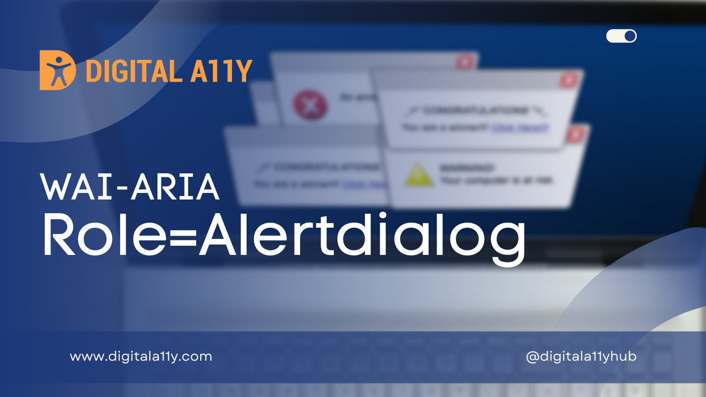
A type of dialog that contains an alert message, where initial focus goes to an element within the dialog.
Description
A type of dialog that contains an alert message, where initial focus goes to an element within the dialog. See related alert and dialog.
Alert dialogs are used to convey messages to alert the user. The alertdialog role goes on the node containing both the alert message and the rest of the dialog. Content authors SHOULD make alert dialogs modal by ensuring that, while the alertdialog is shown, keyboard and mouse interactions only operate within the dialog. See aria-modal.
Unlike alert, alertdialog can receive a response from the user. For example, to confirm that the user understands the alert being generated. When the alert dialog is displayed, authors SHOULD set focus to an active element within the alert dialog, such as a form edit field or an OK button. The user agent SHOULD fire a system alert event through the accessibility API when the alert is created, provided one is specified by the intended accessibility API.
Authors SHOULD use aria-describedby on an alertdialog to reference the alert message element in the dialog. If they do not, an assistive technology can resort to its internal recovery mechanism to determine the contents of the alert message.
Screen Reader Support For Role=AlertDialog
| Expectation | JAWS | Narrator | NVDA | Orca | TalkBack | VoiceOver (iOS) | VoiceOver (macOS) | ||||
|---|---|---|---|---|---|---|---|---|---|---|---|
| Chrome | Edge | Firefox | Edge | Chrome | Edge | Firefox | Firefox | Chrome | Safari | Safari | |
| MUST NOT automatically switch away from reading mode | supported | supported | supported | supported | supported | supported | supported | supported | supported | supported | supported |
Role=AlertDialog Example
HTML Example
This example shows how a notification using role=”alertdialog” can be used to notify someone they have entered invalid information.
<div role="alertdialog" aria-labelledby="alertHeading" aria-describedby="alertText">
  <h1 id="alertHeading">Error</h1>
  <div id="alertText">
    Employee's Birth Date is after their hire date. Please verify the birth date and hire date.
  </div><button>Save and Continue</button> <button>Return to page and correct error</button>
</div>
HTML Example 2
<div role="alertdialog">
  <h1>Warning</h1>
  <div role="alert">
    Your session will expire in 60 seconds.
  </div>
</div>
Characterstics
Superclass Role
- alert
- dialog
Inherited States and Properties
- aria-atomic
- aria-busy (state)
- aria-controls
- aria-current (state)
- aria-describedby
- aria-details
- aria-disabled (state)
- aria-dropeffect
- aria-errormessage
- aria-expanded (state)
- aria-flowto
- aria-grabbed (state)
- aria-haspopup
- aria-hidden (state)
- aria-invalid (state)
- aria-keyshortcuts
- aria-label
- aria-labelledby
- aria-live
- aria-modal
- aria-owns
- aria-relevant
- aria-roledescription
Name From
- author
Accessible Name Required
- True
Semantic HTML
No HTML element equivalent.
Reference
- WAI-ARIA 1.2 Specification
Refer to the notes from the WAI-ARIA 1.2 specification for more information on role=alertdialog. - A11Y Support
The screenreader compatibility for each of the ARIA attributes is taken from the A11Y Support. Please refer to the original source if screenreader compatibility is updated for role=alertdialog.


