WAI-ARIA: Role=Toolbar
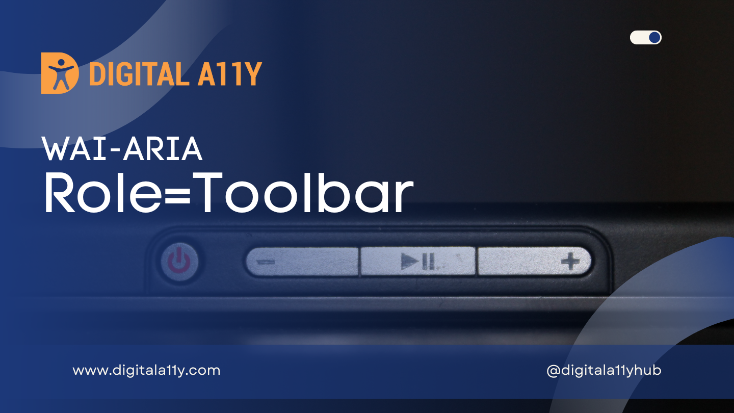
WAI-ARIA: Role=Toolbar
Description
A collection of commonly used function buttons or controls represented in compact visual form.
The toolbar is often a subset of functions found in a menubar, designed to reduce user effort in using these functions. Authors MUST supply a label on each toolbar when the application contains more than one toolbar.
Authors MAY manage focus of descendants for all instances of this role, as described in Managing Focus.
Elements with the role toolbar have an implicit aria-orientation value of horizontal.
Role=Toolbar Example
HTML Example 1
<div role="toolbar" tabindex="0" id="customToolbar">
<img src="/img/btn1.gif" tabindex="0" role="button" id="b1" alt="Home">
<img src="/img/btn2.gif" tabindex="-1" role="button" id="b2" alt="Refresh">
<img src="/img/btn3.gif" tabindex="-1" role="button" id="b3" alt="Help">
</div>
HTML Example 2
<ul role="toolbar">
<li><img alt="New" src="/new.png"></li>
<li><img alt="Open" src="/open.png"></li>
<li><img alt="Save" src="/save.png"></li>
<li><img alt="Close" src="/close.png"></li>
</ul>
Characteristics
Superclass Role
- group
Related Concepts
- menubar
Supported States and Properties
- aria-orientation
Inherited States and Properties
- aria-activedescendant
- aria-atomic
- aria-busy (state)
- aria-controls
- aria-current (state)
- aria-describedby
- aria-details
- aria-disabled (state)
- aria-dropeffect
- aria-errormessage
- aria-expanded (state)
- aria-flowto
- aria-grabbed (state)
- aria-haspopup
- aria-hidden (state)
- aria-invalid (state)
- aria-keyshortcuts
- aria-label
- aria-labelledby
- aria-live
- aria-owns
- aria-relevant
- aria-roledescription
Name From
- author
Implicit Value for Role
- Default for aria-orientation is horizontal.
Semantic HTML
No HTML element equivalent.
Reference
- WAI-ARIA 1.2 Specification
Refer to the notes from the WAI-ARIA 1.2 specification for more information on role=toolbar.
