WAI-ARIA: Role=Tablist
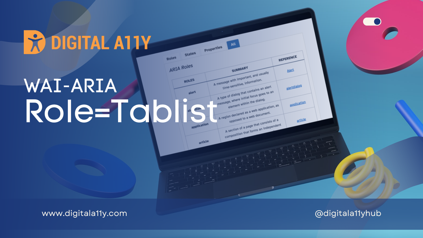
Description
A list of tab elements, which are references to tabpanel elements.
To be keyboard accessible, authors SHOULD manage focus of descendants for all instances of this role, as described in Managing Focus.
For a single-selectable tablist, authors SHOULD hide other tabpanel elements from the user until the user selects the tab associated with that tabpanel. For a multi-selectable tablist, authors SHOULD ensure each visible tabpanel has its aria-expanded attribute set to true, and that the remaining hidden tabpanel elements have their aria-expanded attributes set to false.
tablist elements are typically placed near usually preceding, a series of tabpanel elements. See the WAI-ARIA Authoring Practices [wai-aria-practices-1.1] for details on implementing a tab set design pattern.
Elements with the role tablist have an implicit aria-orientation value of horizontal.
Role=Tablist Example
HTML5 Example
<ul role="tablist">
<li class="active" role="tab" aria-selected="true" aria-setsize="3" aria-posinset="1" tabindex="0">Tab 1</li>
<li role="tab" aria-selected="false" aria-setsize="3" aria-posinset="2" tabindex="0">Tab 2</li>
<li role="tab" aria-selected="false" aria-setsize="3" aria-posinset="3" tabindex="0">Tab 3</li>
</ul>
<div class="panels">
<article class="active-panel" role="tabpanel" aria-hidden="false">
...
</article>
<article role="tabpanel" aria-hidden="true">
...
</article>
<article role="tabpanel" aria-hidden="true">
...
</article>
</div>
HTML Example
<ul role="tablist">
<li role="tab">Introduction</li>
<li role="tab">Chapter 1</li>
<li role="tab">Chapter 2</li>
</ul>
Characteristics
Superclass Role
- composite
Required Owned Elements
- tab
Supported States and Properties
- aria-level
- aria-multiselectable
- aria-orientation
Inherited States and Properties
- aria-activedescendant
- aria-atomic
- aria-busy (state)
- aria-controls
- aria-current (state)
- aria-describedby
- aria-details
- aria-disabled (state)
- aria-dropeffect
- aria-errormessage
- aria-flowto
- aria-grabbed (state)
- aria-haspopup
- aria-hidden (state)
- aria-invalid (state)
- aria-keyshortcuts
- aria-label
- aria-labelledby
- aria-live
- aria-owns
- aria-relevant
- aria-roledescription
Name From
- author
Implicit Value for Role
- Default for aria-orientation is horizontal.
Semantic HTML
No HTML element equivalent.
Reference
- WAI-ARIA 1.2 Specification
Refer to the notes from the WAI-ARIA 1.2 specification for more information on role=tablist.
