A Definitive Guide On How To Perform A Web Accessibility Audit
What is an Accessibility Audit?
An accessibility audit is a comprehensive evaluation process used to assess the digital accessibility of a website, web app, mobile app, or any other digital content. During this audit, the digital content is reviewed against the WCAG 2.2 guidelines, which provide standards for making digital content accessible to people with disabilities. In addition to these guidelines, usability checks are conducted to determine if there are any significant barriers faced by individuals with disabilities while interacting with the content.
This accessibility audit involves a combination of automated tools and human intervention. Automation tools are utilized to identify accessibility issues automatically, but they typically catch only 30-40% of the problems. Therefore, manual checks are crucial and involve using tools such as keyboards, color contrast analyzers, and assistive technologies. These manual methods are essential to uncover issues that automation may miss, making the digital content truly accessible to everyone.
Why is an Accessibility Audit Required?
Accessibility audits are essential because they ensure that digital content, products, and services are usable and inclusive for everyone, regardless of their abilities or disabilities. These audits systematically evaluate websites, applications, and digital platforms to identify barriers that might hinder people with disabilities from accessing information or services.
In today’s interconnected world, digital accessibility is not just a legal requirement but also a moral and ethical obligation. Ensuring that your digital assets are accessible means opening doors to a broader audience, including individuals with visual, auditory, motor, or cognitive impairments. By conducting accessibility audits, businesses and organizations can pinpoint accessibility issues, rectify them, and provide a seamless and equal user experience for all. Moreover, these audits help in complying with legal regulations and standards, such as the Web Content Accessibility Guidelines (WCAG), which are designed to make the digital landscape universally accessible.
In essence, accessibility audits are not just about compliance; they represent a commitment to inclusivity, equal opportunity, and a user-centric approach. By embracing accessibility audits, businesses not only meet legal requirements but also foster a more compassionate, diverse, and inclusive digital environment for everyone.
Who should Perform Accessibility Audit?
The first step towards meeting the accessibility requirements involves evaluating how accessible your website, mobile App, documents etc. are. This requires checking whether or not it meets the international WCAG 2.2 AA guidelines. Checking this in detail requires a large amount of technical expertise and is best left to either:
- An accessibility expert within your organization, or
- A third-party accessibility auditor
Some organizations will not have the expertise to do a detailed check themselves. Paying a third party would place a ‘disproportionate burden’ on them. This means a burden or cost that is too much for the organization to reasonably bear. If this applies to your organization, you’ll have to do a basic check instead. This guide will help you to do that basic check.
These checks outlined in this guidance are probably best done by the person in your organization with the best knowledge of websites. This will usually be the person responsible for updating the website (like a web officer). If there’s no one in your organization with this knowledge, it’s fine to ask a volunteer to do the checks – for example, if someone you know works with websites and can spare the time.
Before you start, check whether it’s reasonable for you to do a detailed accessibility check instead. If it is, then just doing a basic check will not be enough for you to meet the requirements. Once you’ve finished the checks, you’ll need to make a plan to fix any accessibility problems you find.
Preparing to do a basic accessibility audit
You do not need to check every page of your website – just a sample will do. So start by working out what to include in your sample. If you’ve got more than one website or app, you need to gather a sample from each website or app you have.
Your sample needs to include:
- your site’s homepage
- content pages that are mostly text based
- images, video and audio content
- interactive tools and transactions, like forms
- pages including login functionality, if your website has them
- PDFs and other document types you have
- dynamic content like pop-up windows
- navigation pages, including your sitemap and pages with search functionality
You should also include in your sample any pages or websites containing information about accessibility, how to contact you, how to use your site, legal information (for example, terms and conditions pages, or like your privacy policy) and any settings or preferences pages. Once you’ve got your sample, work through the checks outlined in this guidance one by one. It’s likely the checks will take at least a few days, so make sure to give yourself enough time to work through them.
Some of the requirements might not apply to your website. For example, if you do not have any videos then you can ignore the tests relating to video content.
Text content
You’ll need to start by checking the text-based content pages you included in your sample.
Check you’re using proper headings
It’s important that any headings you’re using are styled and coded properly. This is because some users with visual impairments use tools called ‘screen readers’ that read out page content to them. Screen reader users often jump through the list of headings in a document so they can skip to the content they’re looking for. If you’re styling headings just using bold, or by using bigger font, then screen readers will not recognise them as headings. This will stop users from skipping straight to the content they need.
To check your headings are styled and marked up properly, open up the tool you use to edit your website (often known as a ‘content management system’) and check the headings on your sample pages. They’re styled correctly if something like one of the following applies:
- your headings are styled as things like ‘Heading level 2’, rather than ‘Normal text’
- you can see tags like ##, ###, <H2> or <H3>
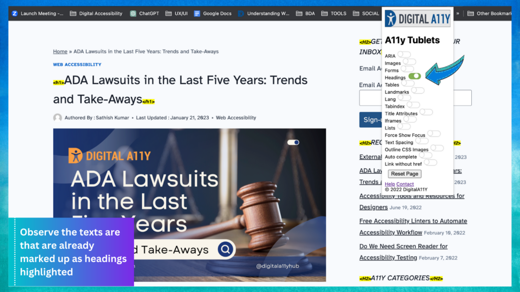
You can also use DigitalA11Y Tublets Chrome Extension to check your headings:
- Open the page you are testing in the Chrome browser
- Run the extension from the Chrome toolbar
- From the list of available options, choose “headings”
- Go to the page and observe the texts are that are already marked up as headings highlighted
- Check the hierarchy, texts that are not marked up as headings and log them as defects.
Check pages are usable when stylesheets are disabled
The way a page looks is controlled by something called a ‘stylesheet’. It defines things like the way a page is laid out and any font colors. Your content should still be usable even if stylesheets are disabled, or are not loading properly. This means it’s still possible for users to complete any relevant tasks or find important information – for example, look for opening hours or contact details, or navigate their way to the form they need to fill out. You’ll need to check your sample pages are still usable when stylesheets are disabled.
How To Test
Option 1:
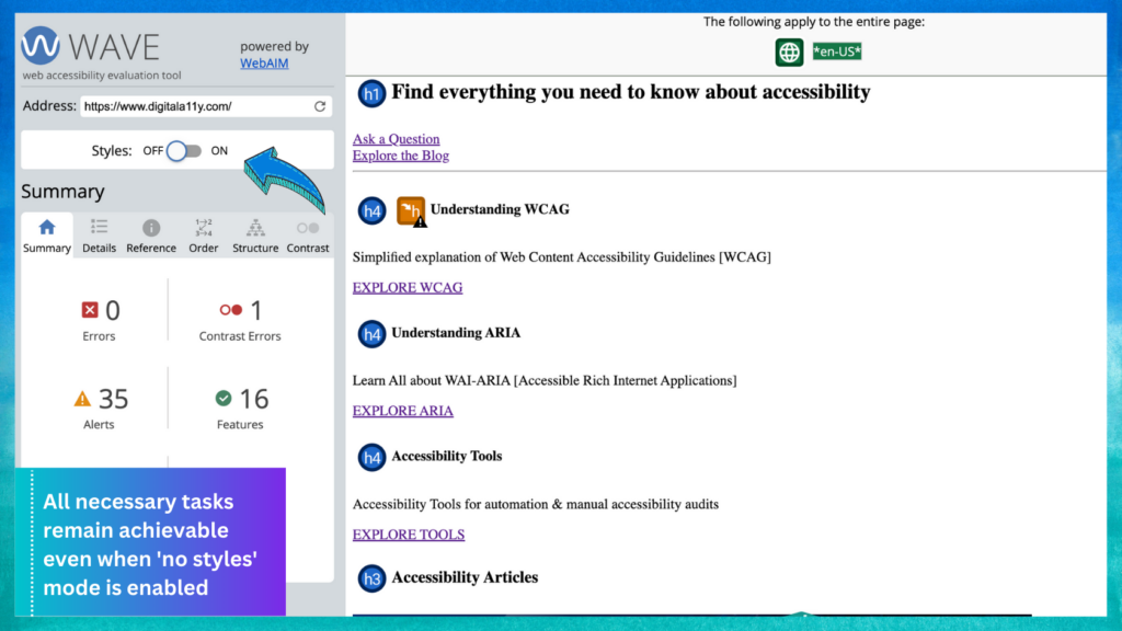
Test this by copying a URL from your website and pasting it into the WAVE tool. Once you’ve done that, select ‘no styles’ from the panel on the left-hand side of the tool. This should give you a much more basic view of the page. Check whether you can still use the content to complete any relevant tasks.
Option 2:
Use browser options: Firefox (Win and Mac)
- Via the menu toolbar, choose: “View” > “Page Style” > “No Style”
- Via the Web Developer Toolbar, choose: “CSS” > “Disable Styles” > “All Styles”
If the Web Dev Toolbar is installed, people can use this keyboard shortcuts:
- Command + Shift + S (Mac) and Control + Shift + S (Win)
- Safari (Mac): Via the menu toolbar, choose “Develop” > “Disable Styles”
- Opera (Win): Via the menu, choose “Page” > “Style” > “User Mode”
- Chrome (Win): Via the gear icon, choose the “CSS” tab > “Disable All Styles”
Check that instructions are styled properly
You need to make sure you’re not conveying instructions in a way that relies on a user’s visual ability. For example, only sighted users will understand instructions like:
- ‘click the round button’
- ‘click the big button below’
- ‘click the red button’
Users who cannot see the page will not know what you’re referring to, because instructions like that rely on visual descriptions. So check your sample of pages and look out for these types of instructions.
Check that links make sense
Check any links on your sample content pages to check that the link text you’re using clearly explains the destination or the purpose. This is important because screen reader users often scan through lists of links in isolation. This means they do not have the surrounding context to help them understand what the link is for.
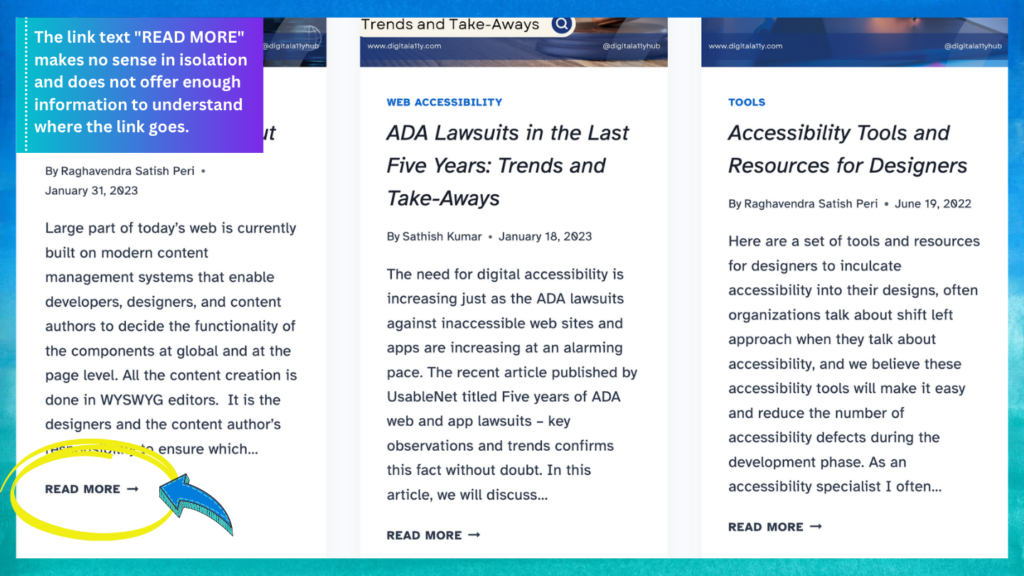
You can check your links by looking at your sample pages and just reading the link text – without paying attention to the surrounding content. If the link text still makes sense in isolation and clearly explains where the link goes, it’s likely the text you’re using is accessible.
If you’re using link text like ‘click here’ or ‘more information’ then you’re probably not meeting this requirement, as link text like that does not describe where the link will go or what it’s for. There’s guidance explaining what good link text looks like if you’re not sure.
Check that pages have good titles
You need to check your pages are titled properly. If they’re not, users will not understand what they’re for and will struggle to find what they need using search.
Your page title should appear in the page tab at the top of your browser. For instance, if you go to the WCAG Checklist you’ll see the text in the tab near the top of the browser is ‘WCAG Checklist – A Free and Simple Guide to WCAG 2.0 and WCAG 2.1’. This is the page title.
Look at the equivalent text for your sample pages. You can hover over the tab to see the full text if it’s too long to fit on the tab itself. Check whether your titles are descriptive. Ask yourself whether they clearly state – in simple language – what the pages are about and the tasks they’d help users complete. For example, ‘Apply for a blue badge – Danbury Council’ is a much more descriptive title than just ‘Blue badges’. Also check that none of the titles are duplicated: if 2 pages have the same title, how is the user supposed to know which one to use?
Images, video and audio content
There are a few things you’ll need to do to check that your sample of images and video content are accessible.
Check any images have a description
You’ll need to check that any non-decorative images (including charts or diagrams) have an accompanying text description. That way, users can still access the relevant information even if they cannot see the image.
Take your sample pages and check that any images either:
- have appropriate alternative (or ‘alt) text that explains the information the image conveys – you can usually check this in the content management system you use to update your website, or
- the content of the image is described in any surrounding body text
You need to check if decorative images are provided with alternative text- these do not need an accompanying description. Ensure these images are provided with a empty alt , generally there will be a option to tag decorative images in the content management system. Also, you can run our DigitalA11Y Tublets to check if all the images have alt text or not. To do so:
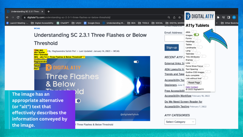
- Open the page on Chrome browser
- Run the DigitalA11Y Tublets from the Chrome toolbar
- Choose ‘Images’ from the available options
- Go to the opened page and you will be able to see all the images with <img> tags highlighted with/without alt text.
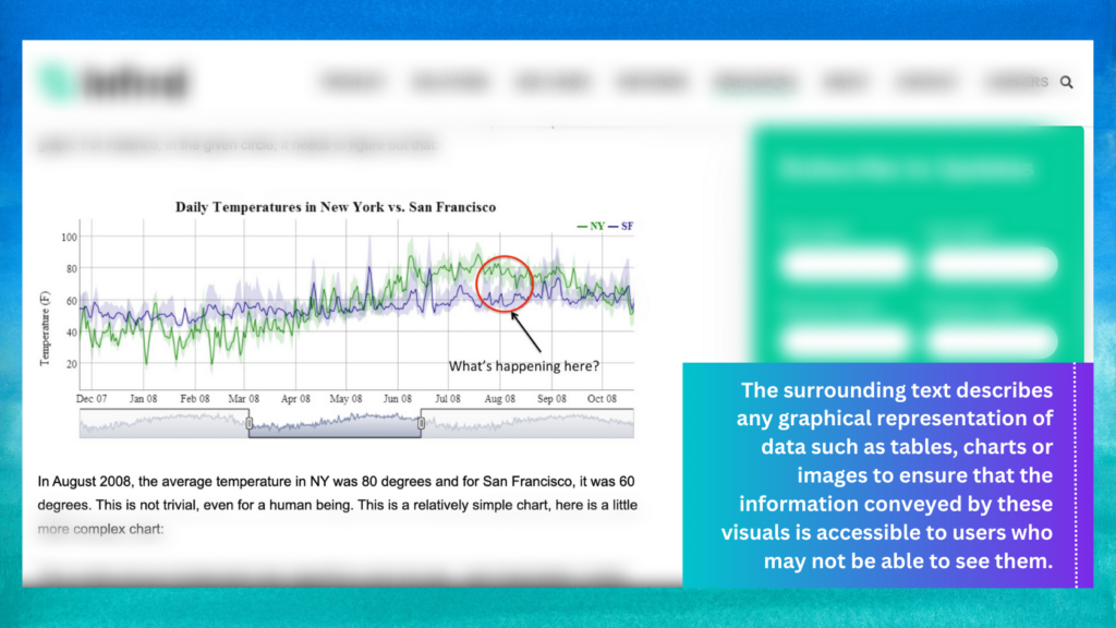
Check that images, charts and tables have a description
You’ll need to check that any visual way of conveying data like a table, chart or image is described in the surrounding text. That way, users who cannot see the images can still access the information the image conveys.
Check for images of texts
You’ll need to check whether any of your sample pages contain text embedded in or converted into images. This is because, users with limited vision and with limited reading abilities would not be able to zoom the image, change the style like font size, font family or spacing for better readability. The information should be published as normal page text instead.
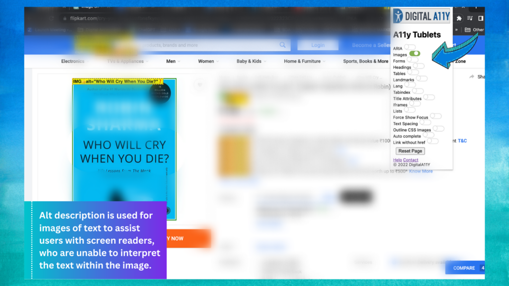
This does not include logos and brand names – it’s okay for those to contain text.
Check any video-only or audio-only content is properly described
As you did with your images, you’ll need to check that any videos or audio content are clearly described so that users who cannot hear them can still access the information.
This firstly means checking that videos have captions explaining any sound effects and dialogue. You should also check your sample videos (maybe 2 or 3) to assess the quality of those captions.
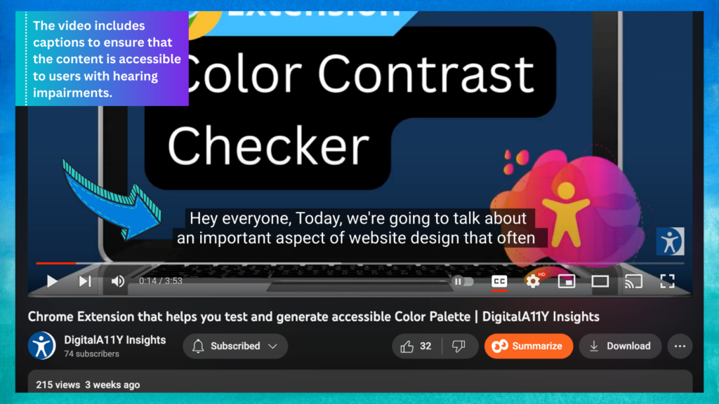
Once you’ve done that, you’ll need to check there are transcripts for any audio-only content you’ve got.
Audio descriptions for video and audio content
When you check through the videos on your website, you might come across things that are part of the video but not described in the audio track – something like the contents of a chart or graph, for example.
If you were only following the audio, you’d miss this information. To make sure users can access the information they need, you’d need to provide an extra audio description to describe anything not covered in the main audio track.
Check your sample of videos to see if an extra audio track is required and whether you’re providing one.
Interactive tools and transactions
Once you’ve finished checking your images, video and audio content, you’ll need to check the forms, tools or transactions you included in your sample.
Check form fields are marked up appropriately
You need to make sure any form fields are marked up correctly. If they’re not marked up properly, screen readers will not be able to tell what a form field is for, or what information the user should enter into it.
You can check your form fields are marked up properly by going to a form and clicking on a field label (the text above, below or next to the field that explains what it’s for). If the field is marked up correctly, clicking the field label should cause your cursor to appear inside the corresponding field.
You can see what this looks like using the DigitalA11Y contact form. If you click on the ‘Your name’ field label towards the bottom of the page, you’ll see the focus of your cursor switches to the field itself. Do this test on a few of your forms to check whether the fields respond as they should.
OR
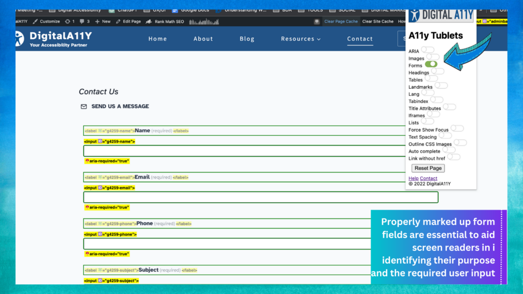
Alternatively this can be tested quickly by running the form option in the DigitalA11Y Tublets extension, this will help identify the form fields that do not have programmatic labels and provide a intuitive way to identify the pass and failure scenarios visually.
Check if it is clear what information users need to provide
As you go through your sample forms, you’ll need to check you’re using field labels in a way that makes clear what information the user needs to enter.
As a general rule, these labels should be specific. Look at your forms and make an assessment as to whether they’re clear. Common mistakes include not labelling fields at all, or using vague labels like ‘Name’ which do not make clear whose name the user needs to enter (for example, it could be a partner or child’s name, rather than the user’s own name).
Check form elements are consistent across your website
When you’re checking through your forms, you’ll need to check that form labels are used consistently. These are the labels that describe the information a user needs to enter into a particular field.
Check your sample to see how you’re labelling the navigational elements. For instance, are you using ‘Submit’ on one form and then using ‘Go’ or ‘Complete’ on another? Are you asking for users’ names and addresses in a consistent manner, or does it vary from form to form?
Check users get a warning before they’re timed out
Some websites time users out after a period of inactivity. This usually results in form data being lost, or the user being automatically logged out of an account.
You need to make sure to warn users if you’re going to time them out after a period of inactivity. You’ll also need to give them the chance to interact with the page to prevent the time out from happening.
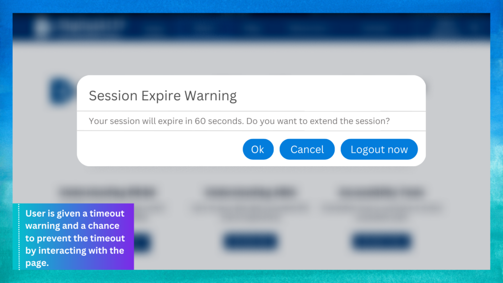
Test whether you’re doing this by going to one of the page on your website and remaining inactive for around 20 minutes. If you get timed out with no warning, then you’re not meeting the requirements. If, after a while, you were given a timeout warning and a chance to prevent the timeout by interacting with the page, you’re likely meeting the requirements.
Check that helpful error messages are provided
When a user provides incorrect information in a form, you need to let them know they’ve made a mistake and help them correct that mistake. You can check how well your website is doing this by going to your sample forms and entering some intentionally incorrect or invalid information. For example, you could enter a future date into a date of birth field or a postcode with too few characters and try submitting the form. This should generate an error message.
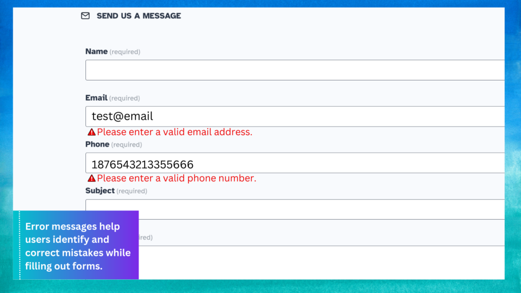
Assess whether the error messages make clear what you need to do to correct the mistakes. Messages like ‘invalid date’ or ‘invalid postcode’ are not very helpful: they indicate that the user has made a mistake, but do not explain why the information was wrong and how to correct the error. Something like ‘You cannot enter a date in the future – please enter a past date’ is much more helpful. Play around with a few form fields to see how helpful and clear the error messages are.
Check users can review their answers before submitting a form
Users need to be able to check their answers before submitting certain types of form, to confirm they’ve entered the correct information. This only applies to forms where there would be serious consequences to them making a mistake – for example, financial transactions or something that enters them into a legal contract.
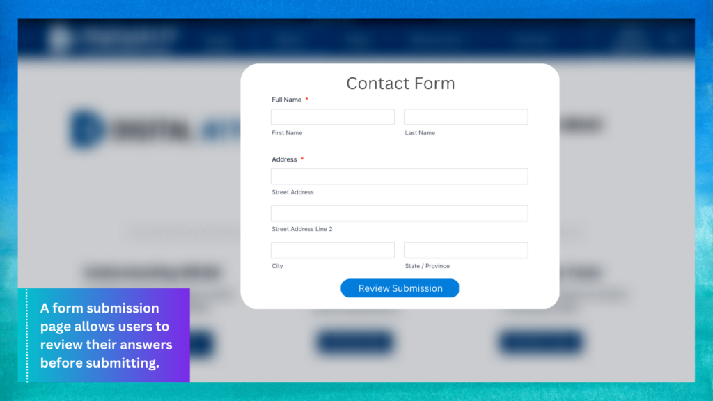
You can test this by going to any of your sample forms that meet these criteria and working your way through them. See if you’re presented with a page that lets you check your answers before submitting the form.
Check that form elements behave as expected
When you were working your way through some of your sample forms, you should have noticed whether interacting with any of the elements caused anything unexpected to happen.
This includes things like a dropdown menu or radio button (an element that lets you select just one of a few options) causing a new page to open when you click on it.
Technology
You’ll need to check that users can interact with your website in the way they need to. This means checking for technological or frontend issues.
Tests using a mobile or tablet device
You’ll need to start by doing some checks using a mobile or tablet device to check that your website is usable on these devices.
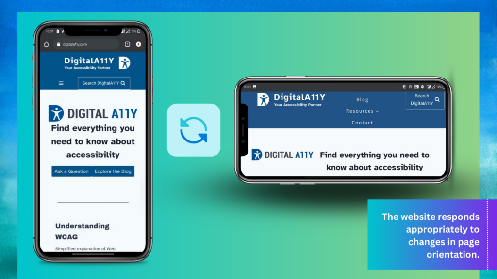
- Check the page orientation: You’ll need to take a few of your sample pages and check they respond properly when you try to change the page orientation. You can do this by loading up a page on a mobile or tablet device and turning the screen from portrait to landscape a few times. The page should respond to fit that view, rather than staying locked in place.

Website adjusts to screen orientation changes, guaranteeing a seamless user experience. - Check you can navigate using just one finger: Some users have limited dexterity or range of movement, which means it’s important that they do not have to use complex gestures that involve more than one finger to navigate your website on their mobile or tablet device. There needs to be a simple alternative that they can use that only requires one finger. Go through your sample content pages and check whether it’s possible to navigate using just one finger. Try things like double-tapping to zoom in and out of the page and holding or hovering your finger over an element to highlight it. It’s worth trying to complete a couple of forms using these techniques, too.
- Check you’re not relying on complex motions: Some more interactive websites or apps require users to do things like shake or tilt their device to complete an action. This will not apply to most websites, but if it applies to yours then you need to make sure there’s an alternative for users who cannot move their device in these ways. Check that none of your sample pages require any of these interactions – and if they do, that there’s another way of completing that task.
Navigating just using a keyboard
Some of your users need to navigate without a mouse, just using a keyboard. You’ll need to do some checks to see how easy it is for them to do that.
The main keys you’ll be using to navigate are the space bar, ‘Tab’, ‘Shift+tab’, ‘Enter’ and ‘Esc’ keys. ‘Tab’ is the key that lets you jump between page elements, while ‘Enter’ and ‘Esc’ let you interact with and dismiss those page elements. The space bar activates buttons, checkboxes and radio buttons.
You might need to enable the tabbing function if you’re using Safari.
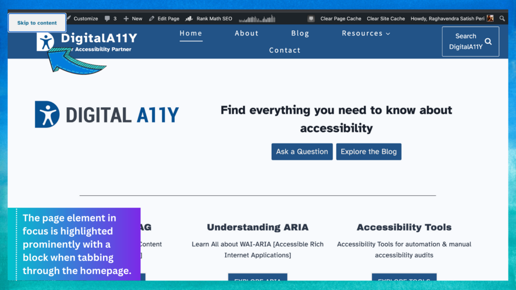
- Check you can tell where you are on the page: When you navigate just using a keyboard, you do not have the mouse cursor to let you know where the focus is on the page. You need to make sure there’s another way for users to orientate themselves and understand which page element they’re focusing on. For example, if you tab through the DIGITALA11Y homepage you’ll notice that the page element in focus is highlighted very clearly with a prominent black block. Spend a few minutes tabbing through a few of the sample pages you selected. Ask yourself whether it’s clear where on the page you’re focused – if it takes you a while to notice which element is in focus then you’re probably not meeting this requirement.

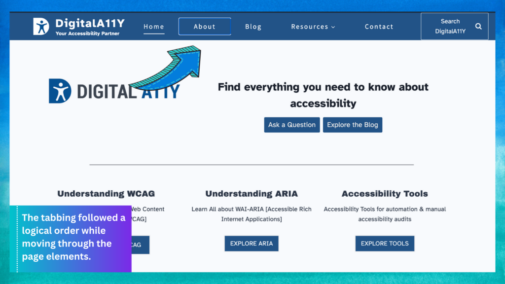
Prominent highlighting of focused page elements eases keyboard navigation for users. - Check the order makes sense when tabbing: While you were tabbing through the page elements, you should have noticed whether the tabbing moved in a logical order. For instance, if you tab on to a navigation bar, you’d expect to be able to tab through the entire bar without the focus jumping off elsewhere on the page. Spend a few minutes testing this on a few of your sample pages, to check you can tab in a logical order.

Navigating through webpage elements using logical tabbing order for improved accessibility and ease of use. - Check nothing unexpected happens when tabbing through a page: When you were tabbing through your sample pages, you should have noticed whether anything unexpected happened. For example, if tabbing onto an element triggered anything like – a new web page to open or a navigation menu to open.
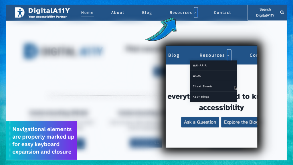
Another thing to look out for is whether you can interact with all the page elements you’d expect to. For example the resources child-menu on DigitalA11Y navigation, feature expand, hide and reveal style navigation. If these navigational elements are marked up properly, you can expand and close them with a keyboard as you would with a mouse. But if they’re marked up incorrectly, you’ll likely tab straight past them using just a keyboard. Look out for things like this.
Properly marked-up navigational elements make expanding and collapsing menus effortless. - Check you do not get stuck when navigating through content: While you’re tabbing through your sample pages, note down any places where you get stuck. Getting stuck means ending up somewhere you cannot navigate away from using just your keyboard. For instance, you might activate a pop-up or interactive element that you cannot skip away from just by using the ‘Esc’ key. People not using a mouse would not be able to move away from a page element like this, which could prove very frustrating. If you find you get stuck, you’re probably not meeting this requirement.
- Check forms are still usable without a mouse: Take your sample of forms and see if you can complete them without using a mouse. This means using ‘Tab’ to jump between the form elements and ‘Enter’ to interact with any navigation elements, like ‘next’ or ‘submit’ buttons. If there are form elements you cannot get through using just your keyboard, then your website is not meeting this requirement.
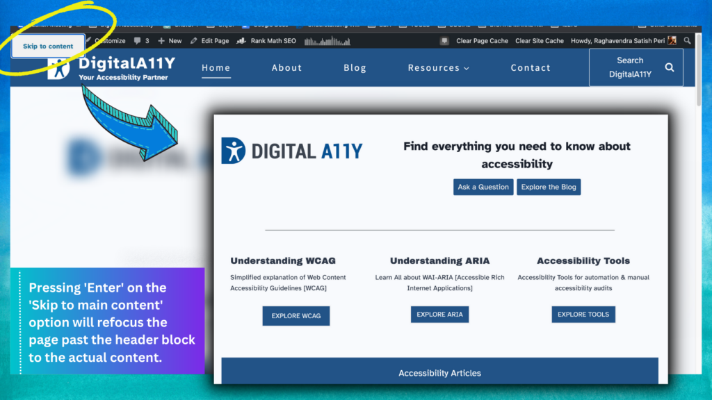
- Check users can skip to the main content on a page: Lots of websites contain several links and navigational elements in the header at the top of the page. Users need to be able to skip past these links straight to the main page content if they want to, so they’re not forced to tab through each item individually every time they open a new page. Some websites give users the chance to skip these header blocks. For instance, if you hit ‘Tab’ when you arrive at the DIGITALA11Y home page, you’ll see the option to ‘Skip to main content’. If you hit ‘Enter’, the page will refocus past the header block down to where the actual page content begins. See if the same thing happens when you hit ‘Tab’ after refreshing a page on your website.

Keyboard accessibility made easy with ‘Skip to main content’ link highlighted and in focus via tabbing. - Checking content is usable when zoomed in or magnified: Some users with visual impairments use screen magnification tools that zoom into the page content, or increase the size of the text. You’ll need to check your content is usable for people using these tools.
- Checking content is usable when you enlarge the text: Take a couple of the forms and content pages from your sample and see what happens if you increase the font size. You can usually do this by changing the settings in your browser. For example, in Chrome you do this by choosing “Settings”, and changing the “Font size” from “medium” to “very large”. Once you’ve increased the font size, try to complete a few tasks using your sample pages. If the page resizes or restructures properly, it should not obscure any of the important information or buttons you’d need to progress through a form.
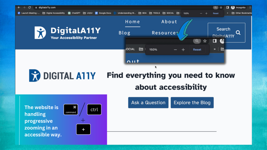
- Checking how the page behaves when users zoom in: You’ll need to check what happens to your pages when you adjust the page zoom in your browser. You can do this either through your browser’s settings or by using a keyboard shortcut – usually ‘Cmd’ or ‘Ctrl’ plus the ‘+’ key. Use the same sample of pages you used when tweaking the size of the text. For each page, see what happens when you zoom progressively further in. If your website is handling this in an accessible way, then you should be able to navigate without using horizontal scroll: the content should reformat in a way that means you only need to use vertical scrolling.

The website adapts smoothly to increasing levels of zoom to maintain readability and usability for all users.
Color contrast
Some users with visual impairments will not be able to interact with your website if the color contrast is set incorrectly. So check the color contrast on your sample pages, including any PDFs or other document types.
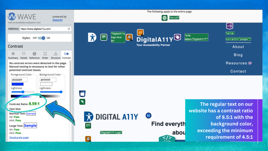
- Check for text contrast: You’ll need to check that the contrast ratio between regular text and the background color of your website is at least 4.5:1. You can use the WAVE tool to check color contrast. This involves copying one of your sample URLs and pasting it into the WAVE tool. Once you’ve done that, select ‘contrast’ from the panel on the left-hand side of the tool. This should show you the color contrast information for the page in question.
- Check any buttons and navigational elements: Like you did for the text on your website, you’ll need to check that the color contrast between any buttons or navigational elements (like ‘next’ or ‘continue’ buttons in forms) and the background of your website is set appropriately. The contrast ratio needs to be at least 3:1 in these cases. Again, use the WAVE tool to check this.
Pop-ups and interactive or flashing content
Pop-ups or flashing images can be very distracting. Users need to be able to disable or dismiss these elements easily.
- Check that users can disable animated or moving content: Things like scrolling carousels or blinking images can be very distracting for people with cognitive disabilities. If your website contains these sorts of elements, you need to check whether users can disable them. Go to any of your sample pages containing these items and see if there’s a way to stop them. Try clicking on them, or interacting with the surrounding content. Check to see if there’s a button to stop or pause the item.
- Check for content that plays automatically: Some websites play audio or video content automatically when a user refreshes or opens a page. If this applies to your website – and the content plays for more than 3 seconds – you’ll need to check users can either change the volume or stop it altogether. There’s likely to be a video or audio box somewhere on the page that you can interact with to do these things.
- Check whether there’s an alternative for people who cannot see maps: Some websites contain interactive maps. It’s very hard to make a map itself accessible to people who have visual impairments using some sorts of assistive technology. At the least, you should provide an alternative for users who cannot use the map. Check any maps on your website to see whether you’re providing alternative routes for users who cannot use the map.
Search and other forms of navigation
You’ll need to do some checks to see how accessible your website’s navigation is. Navigation includes things like search, site maps and navigation categories.
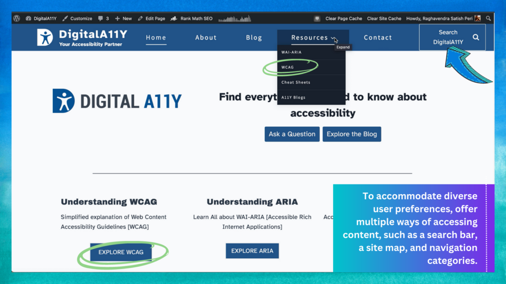
- Check there are multiple ways to navigate your website: Different users have different preferences, which means you need to provide more than one way of accessing content. The most common ways of doing this include- offering a search bar; publishing a site map and offering navigation categories that break up the content by theme. Check that you’re offering more than one of these options.

Various ways to access a webpage, including using a search engine and navigation categories. - Check your navigation behaves consistently: Things like search bars and breadcrumb trails (the list of links that appear at the top of the page to show where in your website’s navigation you currently are) should behave in the same way wherever they appear on your website. You can check for this by going to a few of your sample pages and checking whether the navigational elements are presented consistently. If things like search boxes or navigation menus appear in different places across the pages, you’re probably not meeting this requirement.
- Check links do not trigger on the down-press of a mouse: To open a link, a user has to click their mouse (known as a ‘down event’) and release it (known as an ‘up event’). You need to check that this is how your links behave. Check a sample of your content pages and interact with some of the links – specifically to see whether the links are opened on the down click of the mouse, or whether they only open once you release the mouse button. If they’re triggered on the down event, you’re likely not meeting this requirement.
HTML checks
There are a few checks that require you to look at your website’s HTML (the language that web pages are written in). This is slightly more difficult than the other checks outlined in this guidance, but is not as intimidating as it sounds. The instructions below tell you how to navigate to the HTML you need to check, and the subsections explain what you’ll need to look out for when checking each of the page elements you need to check. This means you do not really need to understand the things you’re looking at, what HTML is or what it does.
The way you view your page’s HTML depends on which browser you’re using. If you’re using:
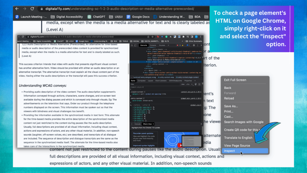
- Google Chrome, right-click the page element you want to check and select ‘inspect’
- Safari, right-click the page element you want to check and select ‘inspect element’ – you might need to enable Safari developer tools first
- Edge, press ‘F12’, then hold ‘Ctrl’ and ‘B’ – once you’ve done that, left-click the page element you want to check
- Firefox, right-click the element you want to check and select ‘inspect element’ – you might need to enable Firefox web developer first. This should open up a panel somewhere on your screen showing the HTML for the page.
Inspect Function on Chrome
Checking tables and bullet lists are marked up properly
Start by checking that any tables and bullet lists have been marked up properly. If they are not marked up properly, screen reader software will not recognise what they are and will not convey the information in a way that makes sense to users.
Follow the instructions above and check a few tables and bullet lists from your sample pages. Once you’ve opened up the source code, look out for the following sorts of tags:
- for tables, look out for <td>, <th> and <tr>
- for bullet lists, look out for <ul> and <li>
If you can see these tags, it’s likely the elements have been marked up properly.
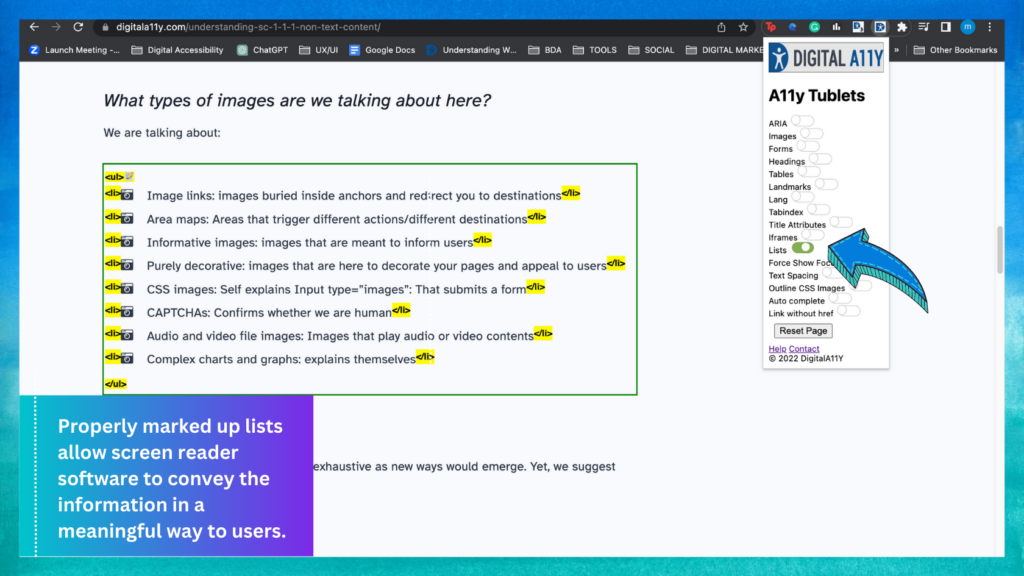
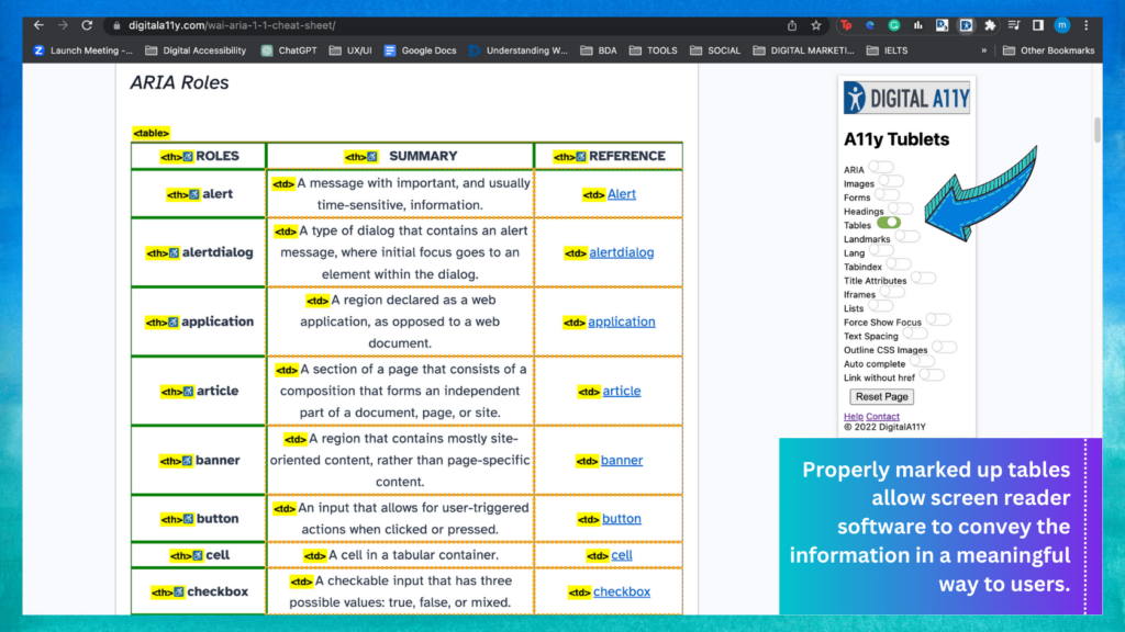
Also, you can use the DigitalA11Y Tublets extension to check the tables and lists:
- Open the page you are checking on Chrome browser
- Run the DigitalA11Y Tublets from the extension toolbar
- Choose ‘Table’ from the available options
- Go to the page and see the tables highlighted if there are table semantics found in the page
- Look at the tables and determine if the tables along with row and column headers are defined properly
- Click ‘reset’ from the options I the extension
- Choose ‘List’ from the available options in the extension
- Go to the page
- See the unordered and ordered lists highlighted if there lists in the page
- Check if all the lists are coded properly.
Check the language the content is written in
A screen reader needs to know what language a page is written in so it uses the correct speech libraries for accent and pronunciation. It only knows this if the language is specified in the page HTML. You’ll need to check the HTML of your sample content pages to see whether your website does this. To inspect the page HTML, use the same method you used when checking whether your content was marked up appropriately.
Once you’ve opened the HTML, scroll to the top of the panel. You should see a <!doctype html> tag. Directly under that you should see an <html lang=” tag. This is where the screen reader finds out the page language. If the page is written in English, the tag should read <html lang=“en” or <html lang=“en-gb”. If it’s empty, the screen reader cannot tell what language the page is in.
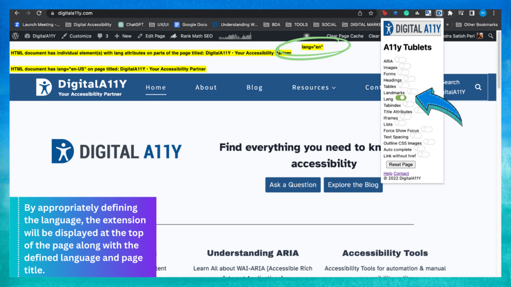
You can also check this using our Digitala11y Tublets extension:
- Load the page on to the Chrome browser
- Load the Digitala11y Tublets extension from the Chrome extension toolbar
- Choose “language” from the available options
- If the language is appropriately defined, the extension will highlight at the top of the page with the defined language and page title too.
If any of your sample pages contain content written in other languages, you’ll need to check that’s marked up properly too, using the country code for the relevant language.
Once you’ve finished the checks
Once you’ve finished these checks, you must start making a plan to fix any accessibility problems you found. While preparing plans, you must prioritize the issues first. You can do so by taking these simple measures:
- Identify issues that stop the users using the site or its functions and fix them
- Take the other issues after fixing those critical/blockers or backlog them for a later time.
Conclusion
We know this is a lot to absorb for a web officer or someone who is a beginner in accessibility. Therefore, we always suggest a thorough audit by an accessibility expert or experts sooner or later. Such audits will uncover more issues that are bothering users with disabilities and elders who visit your sites. Fixing them would increase the customer base, retain the existing user base and benefit for a long term.
Remember! Accessibility audit is just a beginning!
Related Reads
- Manual Accessibility Audit Report
- Breaking Down the Cost of Manual Accessibility Audits
- Writing a Voluntary Product Accessibility Template (VPAT)
- Shift Left Accessibility Testing
Reference: Doing a basic accessibility check if you cannot do a detailed one






This is a great writing on Accessibility audit. I just loved the simplicity of the explanation and the creatives are so well designed that aids in the understanding of the topic.
This is a team effort, Aman. The article was edited by Sathish, another contributor and official editor of the site. The creatives were done by Monika, who joined us a few months back. She’s doing exceptional work in creating videos and other creatives. It’s good to hear that the article is easy to understand and that you’re able to learn about accessibility audit.
Perhaps the best resource for web accessibility …
Thanks a lot! We really appreciate those kind words.
Thanks a lot for this amazing documentation!! Do you have a simple layout to describe this?
Stephany
Hi Stepany,
We provided a table of contents to help you navigate easily to a particular section in the article. We’re not sure what else we can do to provide a seamless experience. We agree that the article is long and would love to hear your thoughts if you have any ideas.
Hello,
Is Ally accessibility report that Canvas generates reliable or enough for auditing the accessibility of online courses? It seems it does not utilize/report on all the evaluation criteria proposed by WCAG.
Thank you for your input.
Nasrin
Hello,
I am not familiar with the tool or canvas that you mentioned. Based on your description, it seems like the tool only tests the editor content and not the entire website. Therefore, I suggest using another tool to test and cross-check the results.
Here are some tools,
https://www.digitala11y.com/accessibility-tools/
Can you show an example of an accessibility audit?
Yes, we can send an example of an accessibility audit report we created. Please fill out the contact form with your business email address, and we will be happy to send it across.
amazing publication
Hi Mati, good to know that article is helpful.
The article was truly awesome! It was incredibly easy to understand. Great job simplifying complex concepts and making them accessible to a broader audience.
Good to know that our WCAG Audit Tutorial article is helpful. Thanks for sharing your views with us.
Great article on performing a web accessibility audit! It’s so important to ensure websites are accessible to everyone, regardless of their abilities. The step-by-step guide you provided is incredibly helpful for businesses looking to improve their web accessibility. I especially appreciate the emphasis on testing with real users and various tools to catch potential barriers.
For companies looking to ensure compliance and enhance user experience, integrating accessibility testing services can be a game changer. These services provide thorough, expert assessments, making it easier to identify issues that might not be obvious at first glance.
Thanks for sharing this valuable resource!