Does WordPress Gutenberg Editor Require a Fix for the Call-to-Action Button Block?
In the past at DigitalA11Y blog, we discussed the Links vs. Buttons conundrum and outlined the accessibility challenges. During a discussion with our design partner, Monika Prasad, she pointed out a critical mistake that seems to be happening on DigitalA11Y. We use WordPress as the CMS platform to publish our content, and for all aspects of design and content, we utilize the native editor Gutenberg.
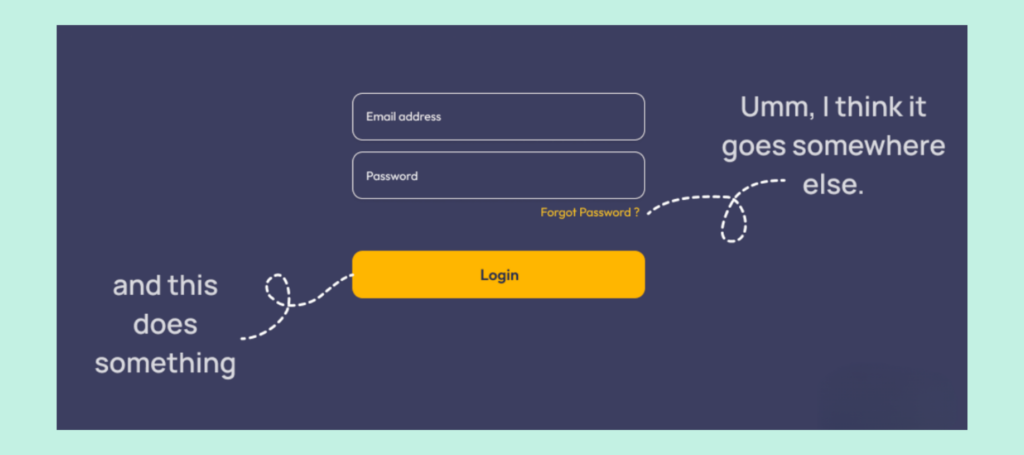
In some of the pages, we used call-to-action buttons. For this reason, we employed the button block in the Gutenberg editor. Although the button block visually outputs a button, it acts as a link for screen reader users, and even in the code, it uses an <a> tag. While most of our call-to-action buttons redirect users to a different page, the design visually appears as a button.
Ideally, the functionality of buttons and links is as follows:
- Buttons perform actions like submitting forms, opening accordions, and more.
- Links redirect users to a different page or to a content area within the same page.
Monika suggested that we update our design for the call-to-action buttons to links to make them more visually appealing and accessible because when a button is used instead of a link, or vice versa, it negatively affects accessibility. Additionally, if there are multiple call-to-action buttons, it looks messy.
This also raises the larger question: Do we need to raise a bug with the WordPress core for this oversight? Ideally, a button must be announced as a button to a screen reader, but because it is being announced as a link, I never thought much about it until the design team flagged it.
Please share your thoughts and opinions in the comments section.

While links aren’t technically buttons, I feel it’s still a good idea to give them clear visual cues that encourage user interaction, especially for standalone CTAs.
Following the argument about buttons, an accordion button acts like a button but, in most cases, it doesn’t look like other buttons.
So, I feel that what’s important is that the text clearly indicates what the user should expect when they click. An icon could also help.
But I do agree that buttons should have visual differences from links.
I agree, using icons as a cue is something I never thought of. Can we use icons where there is a CTA? I never knew that accordion buttons are not similar to other buttons. I need to check this with my sight assistant.
It sounds like a good idea to submit a bug. The disconnect in user experience for AT users as well as any user could be clarified. Having a primary call to action (CTA) clearly indicated, then secondary options, makes the experience better for people using the site. Using and styling buttons and links as specified consistently across the industry will be better all around.
I agree, the only problem the GitHub process to submit bugs for WordPress confuses me. Lot of form fields and not easy process to fill with screen reader. It was frustrating last time I tried.