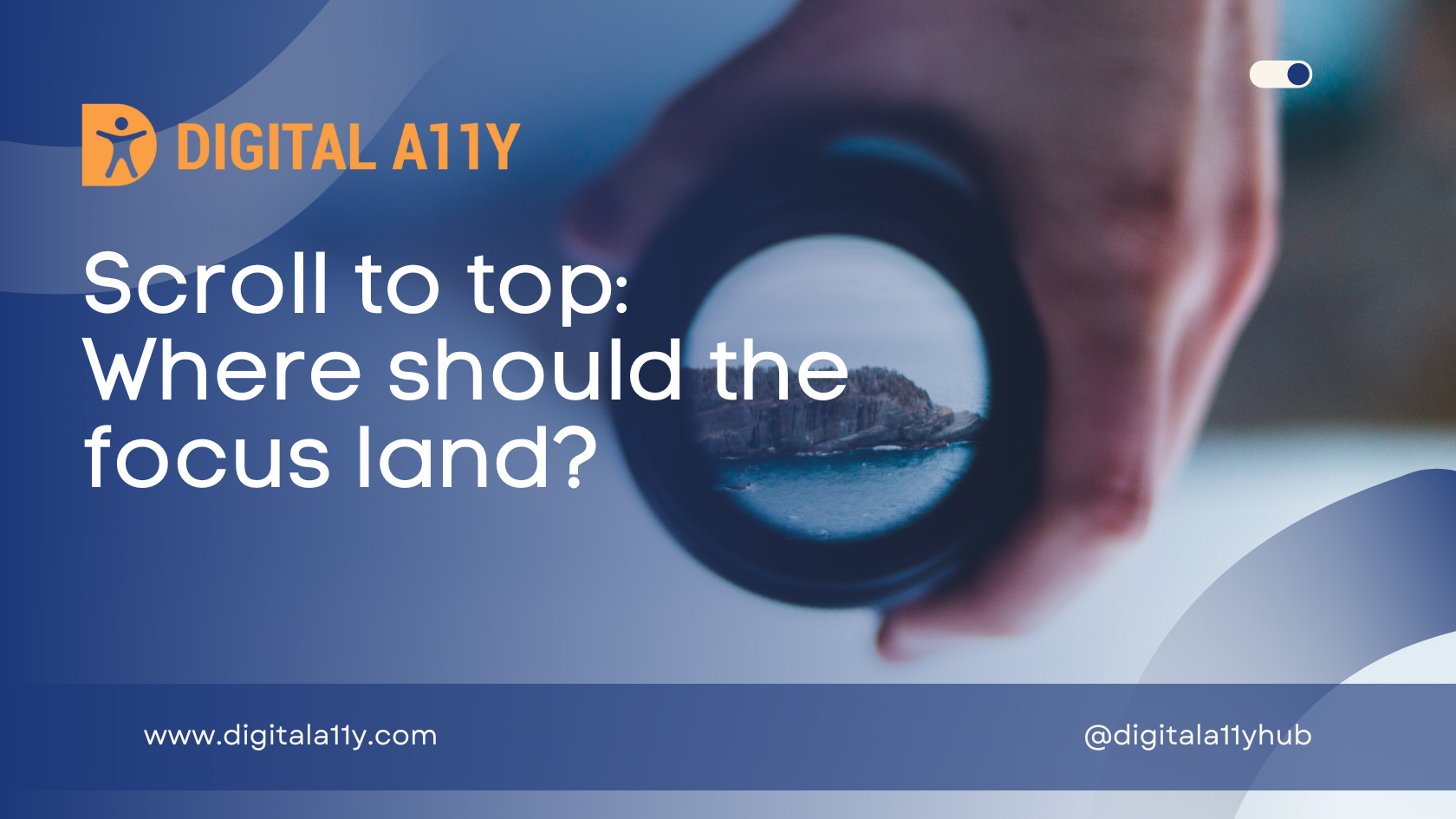
Scroll to Top: Where Should the Focus Land?
Recently, I activated a new theme on DigitalA11y.com to give the blog a fresh start in terms of design and also wanted to upgrade all the old posts into Gutenberg blocks. I chose the Kadence theme as I heard it was one of the best and got started with it. The theme provided a link in the footer Scroll to Top that initially did not work when I activated. The focus visually scrolls but for a screen reader user and a keyboard user, the keyboard focus is still on the Scroll to Top link.
I reached out to developer on WordPress support forum and the developer was very responsive. During our discussion I asked the developer to move focus to “Skip to content” link and he replied that a lot of accessibility specialists he consulted suggested that focus should be set on the body tag.
Here is my question to the accessibility community, where should the focus move in this scenario?
- Moving focus to body tag will not enable screen reader to announce anything. Focus moves to body region and NVDA has no feedback for user. Pressing insert+tab to check current focus announces information that is not helpful.
- the accessible name of the link is “Scroll to Top” so as an accessibility audit specialist, my assumption is that focus moves to Skip to content link.
- The alternative option that I see is moving the focus to heading level one [H1] or the main region landmark.
While all the three solutions provided above pass the accessibility guidelines the larger question is which one of those is most optimized from the usability and user experience?
I asked the same question on LinkedIn and got few answers that are varying in views. If you are an accessibility specialist and has views to share, please do comment your thoughts.


In my experience (8 straight years in web accessibility/20 years in web in general) the best option would be to go with number 3 or a variation of number 3.
This would be dependent on if the “Scroll to top” link is still contained within the current pages content or how you said is strictly limited to the footer of the overall site. If it is a constant, consistent form of navigation throughout all pages on your site or blog then landing on the “Skip to main content” area may work ok. Moving to the body tag, as you pointed out in option number 1 serves now real value purpose for any end user.
If the “Scroll to top” is placed at the end of long pages of content then landing the user on the “skip to main content” is not user friendly. Why have a user click a link, to the then click another link to get back to the start or “top” of the content they have already navigated through? If “Scroll to top” is page specific then go with option 3 as the best choice because it places any user back at the top of the current pages content. The wording here could be more focused such as “Scroll to top of page”.
If it is a site wide feature I would modify the wording of the functionality to avoid any confusion what so ever and perhaps have it read “Scroll to top of site” or something along those lines and then have it land on the “Skip to main content” area so that mega menus or main site navigation can then be reexamined by the user.
Of the 3 options, I tend to favor the second one.
Option 1 could work but “…body region and NVDA has no feedback for user…” would have to be addressed. I haven’t tried, but what if you gave the body element an accessible name? That would resolve the “nothing to feedback” issue (although body isn’t normally focusable in the traditional sense is it? may also need to add tabindex=”0″)
I would absolutely avoid option 3, as the main element is often likely not the ‘top’ – that would often instead be the banner role/header element.
As a user experience designer I feel the second option i.e. skip to main content is more relevant and I believe we can configure the interaction of this button to the most relevant main content as per the website
The decision about where should be the focus largely depend on where the Scroll to Top link is placed on the page. If the link is placed at the bottom of the page in the footer section then the focus should be placed on the first interactive element. I won’t assume that the first interactive element is Skip to main content on all sites.
If the Scroll to Top link is placed towards the end of the main content then moving the focus at the beginning of the main content is certainly an option. However, it all depends on how we describe the link and it would be great to do a user study and figure out what they expect instead of us assuming.
Considering all types of user’s requirements, my opinion is that if a site is having a complex interface it may go to skip link else if its content rich site it should lead to the highest level of heading in the main region.
To have a global solution to this, irrespective of what the page content holds or how the data is presented in the scrollable region, sending the focus on the H1 tag would be the best option where users will get a chance to start reading from top of the main content. This will also help to maintain the logical reading order as well as the relative understanding of the users.
I encourage scrolling to the first interactive element in the page other than “skip to main content” if user activate scroll to top link/button. In case if screen reader is unable to detect the focus after setting focus to an interactive element, I recommend to handle 2 events (keyDown and click) events. As per my experience, if a developer sets focus to some of the element (excluding form fields) in the page, screen reader may announce it only when it is in focus mode (experienced with NVDA) but, will not announce when user is in browse mode in NVDA.
Thanks.
I see no downside to option 3. I believe it (a) best matches the common mental mode, (b) allows the user the full range of page/screen navigation, and (c) is scalable for site-wide application.
I agree with your assumption, no. 2. Scroll to top would put focus back on the “Skip to link” if the screen reader user has just read the article they may want to go back to the navigation. “Top” suggests this. Been put in random place would require lots of shift tabs, even worse experience then having to tab past a “Skip to link” or us it to get to the story. Maybe ask yourself what you want it to do, if it is to go to top of the story then ask if you can edited to say “Back to top of the story” etc..
My apologies, I just reread your original question and realize I confused Options 2 and 3.
Edited response:
I see no real downside to Option 2. I believe it (a) best matches the common mental model, (b) allows the user the full range of page/screen navigation, and (c) is scalable for site-wide application.
Going to #main feels sensible to me, as going to the very start of the HTML can be achieved in other ways if a keyboard is available. (yes landmarks are thing too for those who know about them)
Perhaps the ‘top’ is the muddling.
In some cases ‘Back to contents list’ or similar might be more appropriate.
Maybe if such a link Is deemed necessary it implies a contents list is needed too?
If you’d been linked into the middle of a page though it wouldn’t be going ‘Back’ so maybe ‘[Up to] List of Contents’ ?
[WCAG doesn’t permit positional language, however some do consider ‘up’ and ‘below’ reasonable in some cases.]